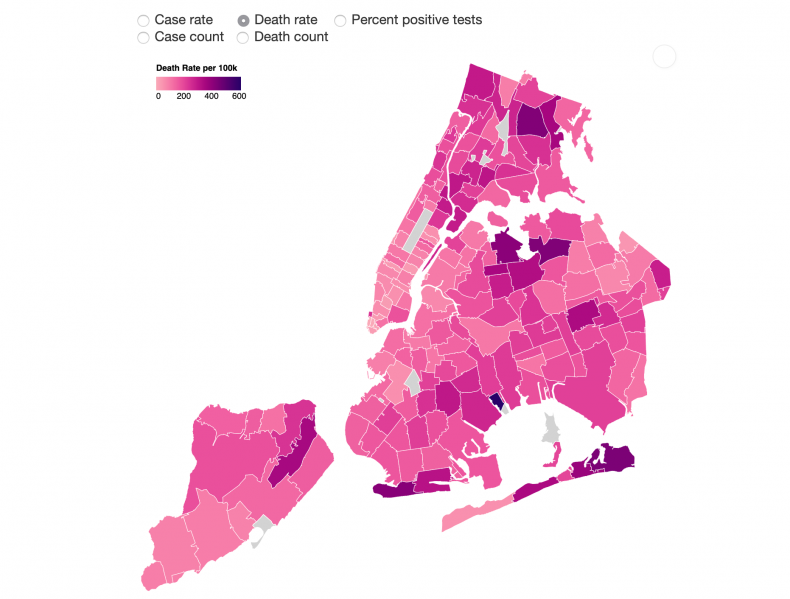
A new map displaying coronavirus death rates in New York City by ZIP code has magnified disparities between communities, with race and income appearing to play a major role in determining who lives and dies after contracting the virus.
Published on Monday by the New York City Health Department, the data shows that neighborhoods with high concentrations of black and Latino people, as well as with low-income residents, have seen disproportionately high death rates compared to more affluent areas with majority white populations.
In an analysis of the data, The New York Times found that of the 10 zip codes with the highest death rates, eight have populations with predominantly black or Hispanic residents and include every borough barring Manhattan, which covered most of the neighborhoods with the lowest death rates.
The 11239 ZIP code in Brooklyn, which has high concentrations of both older residents and black residents, was found to have the city’s highest coronavirus death rate, at nearly 40 percent higher than the area with the second highest rate.
According to city’s data, the area, which is home to less than 13,000 people, has seen 76 deaths.
When it comes to death rates by borough, the Bronx was found to be the hardest hit by the coronavirus pandemic, with the highest rate of deaths related to coronavirus.
Meanwhile, Manhattan appeared to be the least affected, with neighborhoods with higher concentrations of black and Latino residents, such as Central Harlem and Morningside Heights, appearing to still have the highest death rates.
In a statement on Twitter, New York City Council member Mark Levine, who chairs the council’s health committee, said the map confirms the “dramatic inequality” in coronavirus death rates.
Death rates “in low-income communities of color,” the Democrat noted, are “more than ten times greater than wealthier [areas]” affected by outbreaks.
“This should shock the conscience of our city,” said Levine, who Newsweek has contacted for further comment.
NYC data has already shown Latino and black populations to be the hardest hit by the coronavirus pandemic, with the city’s Latino population seeing the highest death rates in the city, while black and African-American people have seen the second highest.
Death rates among white people in New York City, meanwhile, are half as high as those seen among black and African-American residents.
By borough, black and African-American residents have seen the highest rates of death in the Bronx, Manhattan, and Staten Island, while Latino residents have seen the highest rates of death in Brooklyn and Queens, according to city data.
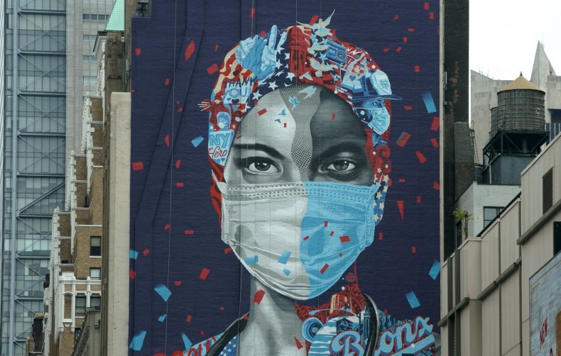
 A mural honoring health care workers at Montefiore Medical Center in the Bronx is seen on the side of a building in midtown Manhattan on May 11, 2020 in New York. The Bronx has the highest coronavirus death rates of all the boroughs in New York City. TIMOTHY A. CLARY/AFP/Getty


