While it may not be quite as “scientific” as human excrement, Nomura’s Global Economics team has developed a simple visual tool to assess the risk of a COVID-19 second wave in 10 US states and 45 countries around the world. The toll currently categorizes 17 countries as “on track” in terms of their economies reopening with no signs of second wave; 13 countries as displaying some tentative “warning signs”, and 15 countries (mostly EM) that are in the “danger zone” as most at risk of a second wave.
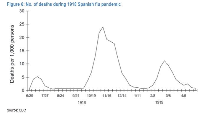
As we first discussed almost two months ago, the global economic and financial market outlook depends heavily on whether the world can avoid a situation similar to the Spanish Flu of 1918, when the second wave of infections was larger – and more deadly – than the first.
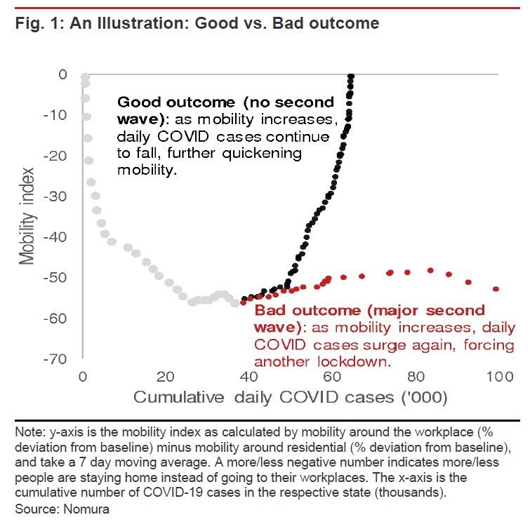
Addressing these investor concerns, and using high-frequency data, Nomura developed an easy-to-use visual tool to help assess the risk of a COVID-19 second wave as economies reopen. The Japanese bank applied the tool to 10 US states and 45 major economies around the world. Figure 1 presents the schematic to this visual tool.
The y-axis is the bank’s mobility index, which is constructed based on daily Google Mobility data. The bank then took the 7-day moving average of this difference. A more/less negative number indicates more/less people staying home instead of going to their workplaces. The x-axis is simply the cumulative number of COVID-19 cases measured in thousands.
The schematic illustrates two scenarios that could unfold.
In the first scenario (Good outcome), a country (or US state) experiences a quick recovery in people mobility as stay-at-
home orders are relaxed. Businesses resume operations with minimal increases in the number of new daily COVID-19 cases. This eases the public fear factor, resulting in a further increase in people mobility, and as the number of new daily COVID-19 cases decline, a positive feedback loop kicks in (i.e., the chart shows the mobility recovery is very ‘steep’, as total COVID-19 cases levels off).
In contrast, the second scenario (Bad outcome) is characterized by a much ‘flatter’ curve. The reopening of the economy is associated with an acceleration in the number of new daily COVID-19 cases (the gap between the red dots widens), the public fear factor grows again and the rise in people mobility comes to a sudden halt, and possibly even reverses, as lockdowns are reimposed.
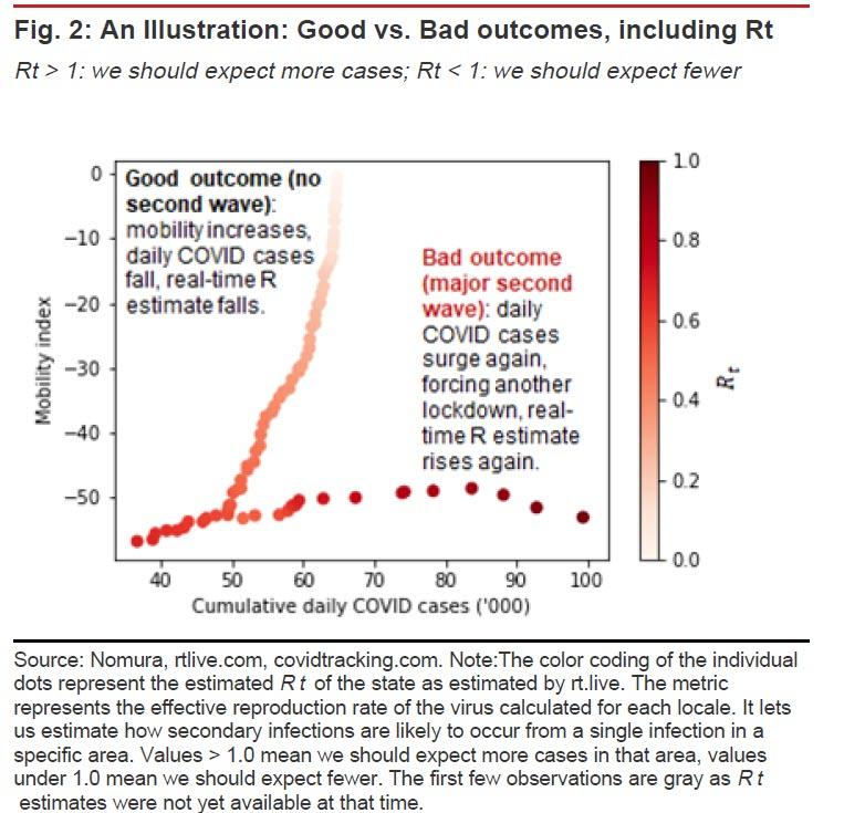
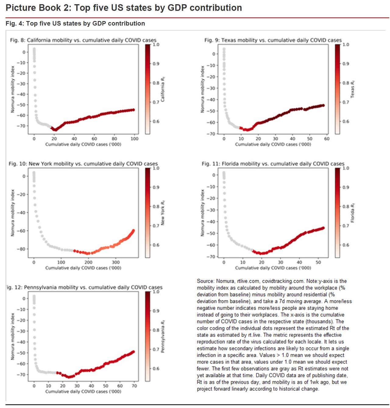
In the case of US states, Nomura supplements the analysis by adding a real-time estimate of the reproduction rate of the virus (Rt ), where the most dangerous sign of a second wave is the dots moving East and turning darker (see Figure 2).
Results
The visual tool is based on the latest available daily data on Google mobility and confirmed COVID-19 cases. The number of COVID-19 cases is updated daily but the mobility index lags by about one week (latest available is 21 May) and so to fill in the missing observations, Nomura’s Rob Subbaraman projects forward by linear interpolation of the historic trend. The results are shown below for 10 US states and 45 major economies around the world. It is admittedly a subjective exercise, but based on the visual tool it categorizes the results into three groupings:
On track: increasing mobility and no sign of a second wave;
Warning signs: increasing mobility and some tentative warning signs;
Danger zone: Most at risk of a second wave
US states
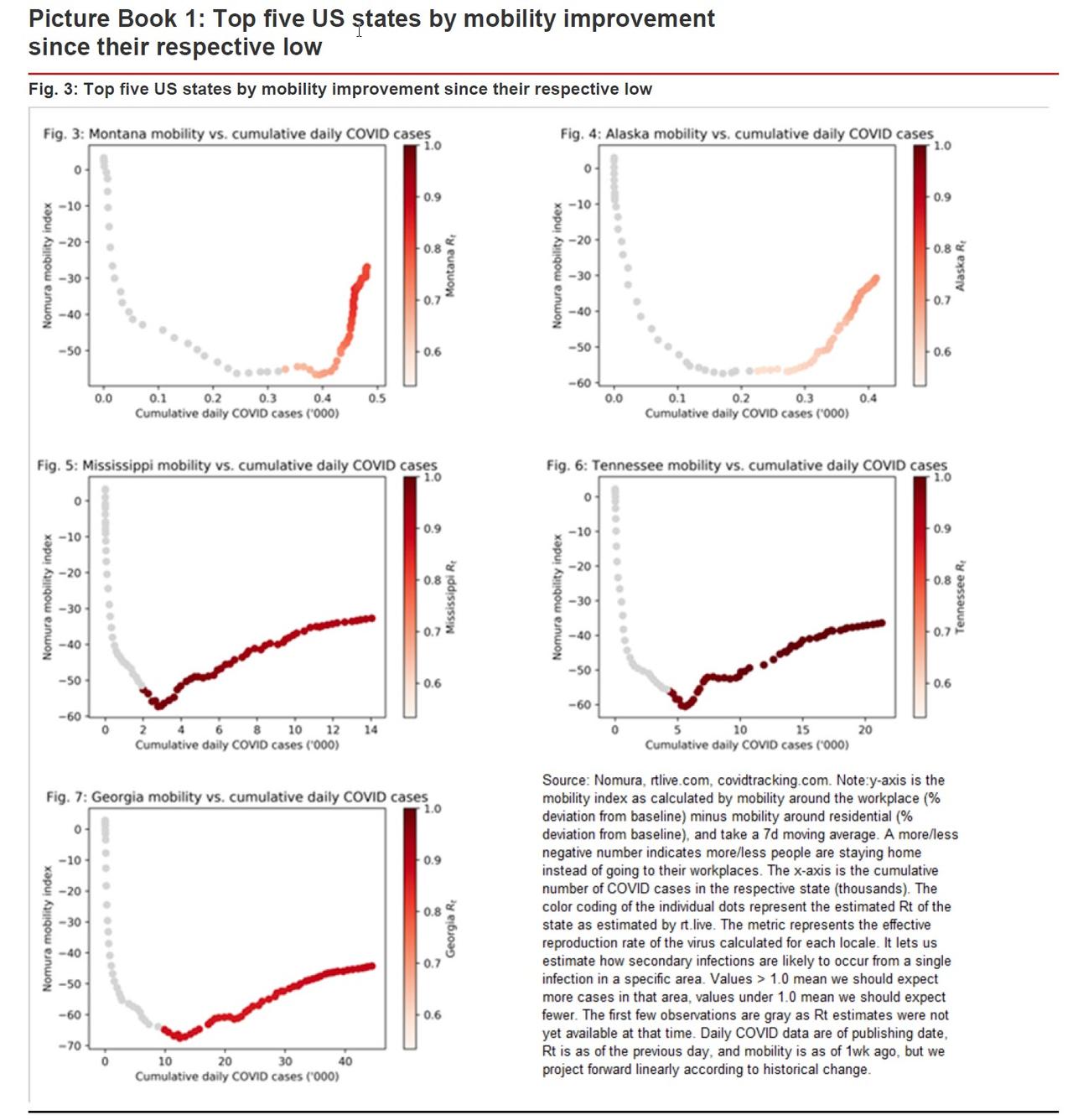
The analysis tracks two sets of 5 US states that represent different angles to analyse the data. The first set are five states that have experienced the sharpest recovery in the mobility index: Montana (MT), Alaska (AK), Mississippi (MS), Tennessee (TN), Georgia (GA), which represent a combined ~5.7% of U.S. GDP. The second set (see Picture Book 2) represent the top five states by GDP contribution: California (CA), Texas (TX), New York (NY), Florida (FL) and Pennsylvania (PA), which represent a combined ~41% of U.S. GDP.
The findings show that the characteristics of the ongoing reopening, both in terms of pace (how ‘steep’ is the ongoing recovery in mobility?) and Rt (how sustainable is the reopening?) can differ markedly across states.
On track: Montana and Alaska are potential model cases where mobility has improved drastically along with minimal increases in daily COVID-19 cases (i.e., the chart shows the recovery line is very ‘steep’), while estimated Rt remains reasonably below 1.0 (i.e., light colored dots), although for Montana Rt has recently risen a little.
Warning signs: Here, Nomura is closely tracking Mississippi, Tennessee and Georgia, as there are some, albeit very tentative, warning signs of a potential second wave in these states. Mobility has increased, but the curves are flatter, indicating that the number of COVID-19 daily cases continues to increase and, for Tennessee, Rt is close to 1.0.
If the dots for these three states continue to move eastward, darken in color with an increasing interval between them, they could move into the Danger Zone. Of the top 5 US states by GDP contribution, the reopening of their economies has been more gradual, judging by the flatter curves, and all five are still experiencing still-high number of daily COVID-19 cases, albeit so far no acceleration (increasing intervals between the dots). States such as California and Texas are particularly noteworthy, as they also register an Rt close to 1.0.
45 countries
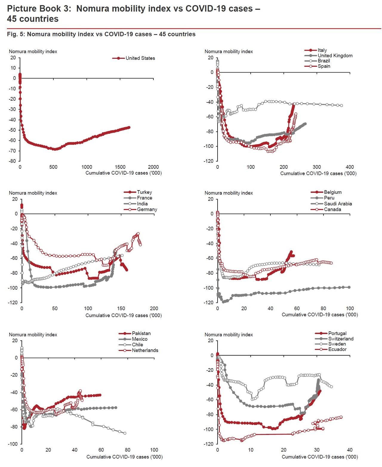
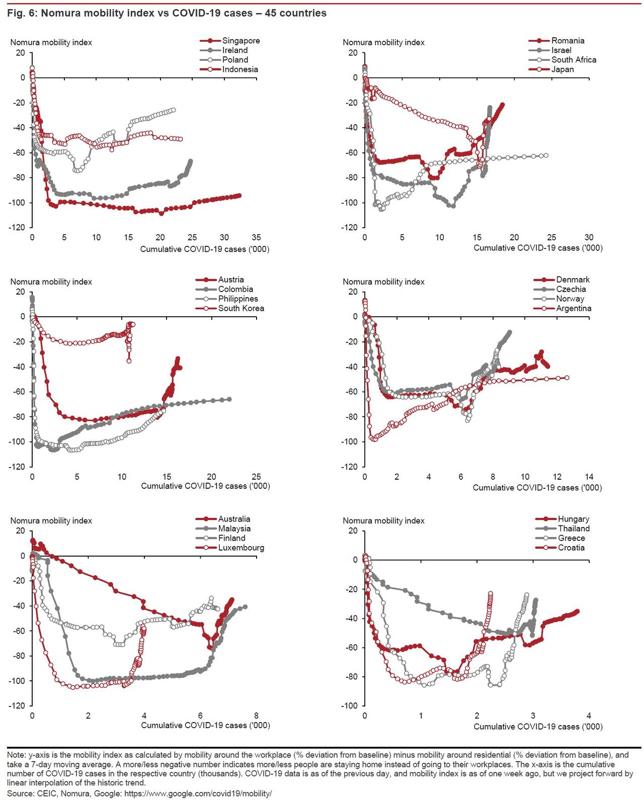
The analysis is then extended to the whole of the US and 44 other countries (see Picture Book 3). These countries are selected based on three criteria:
- relatively large cumulative number of COVID-19 cases per 1mn population;
- experiencing a sharp rise in our mobility index; and
- have relatively large economies.
Nomura’s interpretation of the results are as follows:
- On track: Italy, Spain, France, Belgium, Switzerland, Israel, Japan, Romania, South Korea, Austria, Czech Republic, Norway, Luxembourg, Australia, Greece, Thailand and Croatia are on good track of mobility recovery while at the cost of only limited increases in daily COVID- 19 cases, signaling low risk of a second wave as of now.
- Warning signs: US, UK, Turkey, Germany, Netherlands, Portugal, Poland, Ireland, the Philippines, Denmark, Malaysia, Finland, and Hungary are also in the stage of mobility recovery, although the recoveries have been more gradual than the first set of countries above. However, this is associated with still-high daily COVID-19 counts, indicating a moderate risk of a second wave.
- Danger zone: Brazil, India, Pakistan, Saudi Arabia, Peru, Canada, Chile, Ecuador, Sweden, Mexico, Singapore, Indonesia, South Africa, Colombia and Argentina are still suffering from relatively large increases in daily COVID-19 cases and, consistent with this, our mobility index has been slow to rise. These countries are nearly all emerging markets, which could be at the highest risk of a second wave upon the gradual relaxation of lockdown measures.
And here are the case by case charts, first for states:
… and next for countries:
